Cultural Biases in Responses to Scale Questions

When interpreting results from global surveys and making comparisons across countries, consider how cultural differences can influence responses to even the most seemingly straightforward scale questions:

“[A] 26-country study shows that there are major differences in response styles between countries that both confirm and extend earlier research. Country-level characteristics such as power distance, collectivism, uncertainty avoidance and extraversion all significantly influence response styles such as acquiescence and extreme response styles.

Further, English-language questionnaires are shown to elicit a higher level of middle responses, while questionnaires in a respondent's native language result in more extreme response styles. Finally, English language competence is positively related to extreme response styles and negative related to middle response styles.” (Anne-Wil Harzing)

Needs, Likes, and Wants

There are more than 300 types or sizes of toothpaste in retail today. Dozens of new toothpaste SKUs are launched each year. Some 200 hundred of new yogurt varieties. There are 53 varieties of Campbell soup on a supermarket shelf.

How do people decide which toothpaste to buy, which yogurt, or which soup when everything is equally convenient and roughly the same price?

When consumers exit the default grab-and-go mode and pause to deliberate about options, they try to evaluate how each alternative fits into the future they imagine based on the signals about the product available to them at the time.

The alternatives are evaluated on three dimensions: needs, likes, and wants.

Needs help people screen out the options that are not, in their mind, suitable for a job at hand. The requirements of the job may evolve throughout the purchasing process as consumers acquire more information, and so will the screening criteria. Consumers might come into the store looking for a nail and leave with a tube of superglue.

When marketers talk about low-involvement and high-involvement categories of products, they refer to the categories that differ in how firmly the requirements have been formulated and how well-understood the options are. Shampoos, for example, are generally considered low-involvement category because it’s a product that’s bought and used frequently enough for the consumer to remain familiar with it, and what one wants from a shampoo doesn’t change very often. But there’s nothing about shampoos themselves that’s inherently low-involvement. Try, for example, choosing a shampoo in a store on a trip to a country whose language you can’t read. It may be more useful to think about different categories as high-confidence and low-confidence.

I spent a lot of time on trying to understand likes and wants and wrote a longer essay on the subject, but in a nutshell:

Likes have to do with people visualizing how using different products will feel to them and doing mental accounting of pains and pleasures, costs and rewards. Speaking technically, it is the valence of the visualized outcome that determines preference.

The balance between costs and rewards for a brand constantly shifts. If you have been using something for a while, you may feel that buying something different the next time will give you more joy. So to keep the money in the family, brands release new SKUs to prevent people from switching to a competitor.

Wants are psychological drives that have evolved over millions of years to guide our ancestors towards behaviors that would guarantee survival and procreation. When a want is salient and a brand is seen as a way to attain it, the want circuitry overrides likes and needs. One way to tell if a brand is wanted is by a line outside the store on a launch day.

How To Ace the Creative Test

Many advertisers run their ads through a feedback process before the ads go live but, in my experience, creatives whose work is to be pre-tested rarely know how the tests work.

The opaqueness makes the testing process unnecessarily adversarial: instead of providing a feedback loop, testing is seen as a black box that doles out electric shocks.

Whether intentional or not — and some research companies such as Ameritest are remarkably open about their methodology — the opaqueness benefits nobody. Assuming pre-test results are a reliable predictor of ads’ future marketplace success, every party will benefit from agencies being able to “study for the test”: pre-pretesting the work ahead of the big day on their own, and making iterative improvements in an attempt to boost the scores.

So if your work is about to be pre-tested, here’s what will be on the test.

There are two ways to gather pre-launch feedback on an ad: either by asking a few people deep, open-ended questions and summarizing and interpreting their responses (“qualitative”), or having many people do something that can be easily tabulated and combined into a score (“quantitative”). Usually, clients rely on quantitative research to make “go or no-go” decisions, especially if the media budgets are substantial.

Different research companies have their own quantitative techniques, ways to calculate the scores, and opinions about what a good score is. Generally, quantitative testing techniques can be:

  1. Direct. Show the ads to respondents in a survey and ask them questions about the ad.

  2. Experimental. Show the ads to some survey respondents and not to others, ask all of them questions about the brand, and then compare the answers of those who were shown ads with those who weren’t. Some techniques measure the differences in participants’ performance on different tasks: choose something, remember something, notice something.

  3. Bio-feedback. Show the ads to survey respondents who are hooked up to devices that measures their heart beat, brain waves, skin conductivity, and eye movements.

Some tests combine several techniques, but many use only one.

Nielsen, Kantar Millward Brown, Ipsos, and Ameritest are the four big research companies in the US that do pre-testing, but there are at least two dozen smaller others. Many of them offer multiple types of testing, but the formats that rely on asking a few hundred people questions in an online survey are the cheapest, fastest and the most common.

Research companies have hundreds of questions in their reserves, but there are only eight types of questions that matter.

Comprehension
These questions measure whether participants understand the ad correctly and can play back the key idea, benefit, or message you are trying to communicate:

  • What was the company trying to tell you?

  • What was the main message or idea of the ad?

  • Which of these themes was the ad about? (followed by a list of options)

  • Was the ad clear or confusing?

Likeability
There's a popular theory that the degree to which the ad is liked predicts how effective it is (see papers), and many tests ask participants a “liking” question:

  • How much will you enjoy seeing this ad on TV?

  • Did you like or dislike this ad?

  • Was the ad appealing?

Emotion
It’s become common to ask respondents about how the ad made them feel, usually by picking from a list of words such as “happy”, “surprised”, “confident”, etc. There’s not a whole lot of consensus around which emotions should be on the list, or which indicate a superior ad: envy, for example, is a negative emotion but a powerful purchase motivator. Here’s a solid list of 26 emotions along with an explanation why each was selected (pdf).

Breakthrough and Attention
There are a lot of ads out there, and advertisers want to know if theirs is going to stand out:

  • Did the ad get your attention?

  • Is the ad interesting or involving, or boring?

  • Would you notice it if it were on TV?

  • Would you watch it again if you saw it on TV?

Some tests ask whether the ad was relevant or relatable, which is intended as a way to measure both attention and retention:

  • Is the ad/product relevant to you?

  • Have you learned something new from the ad?

  • I can relate to the people or situations in the ad

Memorability
It’s not clear whether someone can predict what they will remember, but it doesn’t stop the tests from trying:

  • Does the ad stick in your mind?

  • Was the ad unique?

  • Was the ad different from ads for other similar products?

Brand Linkage / Branding
There are several different ways to measures whether people will remember the product or the brand after seeing the ad:

  • What brand was the ad for?

  • A question with answer options that range from “The ad could have been for any brand” to “You can’t help but remember the brand”

  • Ask respondents to describe the ad and then count the number of times the brand is mentioned.

Persuasion and Motivation
Measures whether the ad does what it needs to do: change one’s opinion about the brand or product, or make them want to do something. The questions are usually straightforward:

  • This ad made the company seem more/less appealing

  • The ad makes me want to buy the advertised product / visit website / look for more info

  • The ad makes me more/less interested in…

Negatives and Disaster Check
These types of questions look out for people who have strongly negative feelings about the ad.

  • Irritating

  • Boring

  • Misleading

  • Confusing

“Offensive” is not something a lot of systems check for, although they probably should.

Even if you know nothing else about the research company or the test itself, you can improve the ad’s results by “studying” to these eight types of questions. Use these questions to roll your own questionnaire, and pre-test your ads using one of the many inexpensive DIY survey platforms (I recommend my friends at AYTM).

While your survey is fielding, catch up on the debate about pre-testing with the famous 1974 book Testing to Destruction (pdf).

The Origins of Brand Planning

I had assumed that the formulation of human motivations began in the late 1930s with Murray, to be followed by Maslow in the 1940s, and eventually finding its way into advertising via Dichter and other "hidden persuaders" in the 50s and 60s. But then I found what appears to be the first advertising textbook, The Principles of Advertising, originally printed in 1918.

One of the book's authors, Harry Hollingworth, was a psychologist who was among the first to link the world of psychology with the business of advertising. The textbook has an entire section on what it calls "human instincts" that are remarkably similar to the modern taxonomies of human motives, from Schwartz’s Values to Reiss's 16 basic desires.

The concept of instincts likely goes all the way back to Wilhelm Wundt, one of the fathers of modern psychology, who in the 1870s came up with the instinct theory of motivation. With time, researchers ended up cataloging some 4000 of these instincts. In the US, one of the main proponents of the instinct theory was a British psychologist William McDougall. (The 1909 Introduction to Social Psychology describes his theory in great detail.) Hollingworth knew Freud's work through McDougall, who at the time was visiting at Harvard. It is likely that McDougall, through Hollingworth, was how the instinct theory of motivation ended up in America's first advertising textbook.

And so it looks like brand planning was introduced to the US twice, and both times by Brits — once in the 1920s, and then some 50 years later.

The Third Kind of Retail Interface

I spend a lot of time in client’s stores observing how people use their phones while shopping. A lot of shoppers talk on the phone as they walk around. Their conversation may be about anything, but now they are in front of the shelf, and you can practically hear this conversation – “Hey, I am looking at these shoes here, they are just $150, really nice, what should I do?”

Shoppers check prices at online retailers and offline competitors.

Shoppers navigate the stores using digital shopping lists.

Many use their phone to post pictures on Instagram from the store. “Hey, how do I look?” The phone is their social mirror.

They check for coupons. One of my retail clients didn’t offer coupons. But if you are at the store and you search for that brand’s coupons, you would land on retailmenot.com or dealsplus, and you would see “Save Up to 60% for Shoes on Sale”. Now that you are seeing that a similar product is available elsewhere at a lower price, are you going to go through with your purchase?

Using a new metaphor for something long familiar will often unlock new ways of thinking about it.

Interfaces are a computer term that means a point of interaction between a human and a system, a space were the interaction occurs. Interfaces help humans achieve their goals. A store is an interface between a shopper and the retailer. Interfaces, through usage, create habits and expectations. No matter where you go, you expect the shopping cart button that works in a certain way, and a cash register, and a fitting room.

The two major types of shopping interfaces — online stores and physical stores — have different expectations and behaviors associated with them. In physical stores, you touch, try things on, hunt, browse, ask for assistance. Online stores allow you to compare prices, read reviews, save things for later, share something with a friend.

The online store and the physical store used to be not only distinct, but also separated by a physical distance. An online store is at home, a physical store is at the mall. But what happens when that distance shrinks and people start shopping online and offline at the same time?

Not many stores are ready.

Mood


The FCB Grid

Richard Vaughn, a research director at FCB, developed in 1978 an approach to advertising planning that has become known as the FCB Grid. The model suggests that there are purchase decisions where thinking is most important and others where feeling dominates in situations requiring more or less involvement.

Vaughn’s paper ”How Advertising Works: The Planning Model” published in Journal of Advertising Research in 1980 (read it here), describes four different advertising approaches suggested by the model for products in each quadrant.

The FCB Grid earned its place in advertising textbooks. At some point, it looks like FCB took out an ad to pat itself on the back.

An ad published by FCB, most likely in JAR — found in a book about drawing and innovation.

Communication Multimodality

Ray Birdwhistell was an anthropologist who founded the field of kinesics, the study of body movements. In his influential Kinesics and Context, he argues that human communication is more than just the verbal aspect of it:

We cannot investigate communication by isolating and measuring one channel, the acoustic. Communication, upon investigation, appears to be a system which makes use of the channels of all of the sensory modalities. By this model, communication is a continuous process utilizing the various channels and the combinations of them as appropriate to the particular situation. If we think of Channel 1 as being the audio-acoustic (vocal) channel, Channel 2 as the kinesthetic-visual channel, Channel 3 would be the odor-producing-olfactory channel, Channel 4 would be the tactile and so on. Thus, while no single channel is in constant use, one or more channels are always in operation. Communication is the term which I apply to this continuous process.

communication channels.PNG

The channels act to provide redundancy, to reinforce each other, and to provide additional context and depth:

Redundancy makes the contents of messages available to a greater portion of the population than would be possible if only one modality were utilized to teach, learn, store, transmit, or structure experience. Multichannel reinforcement makes it possible for a far wider range within the population to become part of and to contribute to the conventional understandings of the community than if we were a species with only a single-channel lexical storehouse.

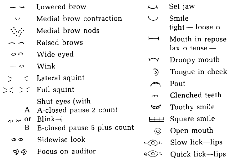
Birdwhistell developed a system of kinegraphs to annotate body movements captured in the interviews he had filmed.

kinegraphs.PNG

Transcribed interviews would look like this:

kinerecord.PNG

Insights: Understanding How Things Work

There are many definitions of what an insight is, and a few useful ones. An insight can be a novel revelation that leads to unexpected ideas. An insight can also be a perception of a unique opportunity that exists in the marketplace at a particular time. Finally, an insight is an understanding of how things work — the causal rules that govern a particular system.

We need to understand these causal rules in order to make tools that are effective within the system:

Scientists have noted that animals that exhibit higher intelligence have two notable descriptive differences. First, these animals are capable of using tools. Second, they tend to live in complex social structures.

One simple model for the process of intelligence in the creation and use of tools is illustrated in the upper row of boxes in [the chart]. Here, the first step is to make sense of reality. By making sense of reality, simple causal relationships can be understood. This understanding of causality, in turn, allows for prediction and finally the use of tools.

The chain, while simple, is extremely powerful. It has led to ravens using simple tools, to early man creating stone weapons and wheels, and eventually to modern man creating the Large Hadron Collider.

The Sense-Making Process and Its Side Effects, from Systems Thinking In Business by Rich Jolly

The Sense-Making Process and Its Side Effects, from Systems Thinking In Business by Rich Jolly

Long-Term Memory Systems

“Memory is not a single entity but consists of several separate entities that depend on different brain systems. The key distinction is between the capacity for conscious recollection of facts and events (declarative memory) and a heterogeneous collection of nonconscious learning capacities (nondeclarative memory) that are expressed through performance and that do not afford access to any conscious memory content.” (Squire and Zola, 1996)

“A taxonomy of long-term memory systems together with specific brain structures involved in each system.”

“A taxonomy of long-term memory systems together with specific brain structures involved in each system.”

What Should We Make?

possible-desirable-effective.png

When you can make almost anything, how do you know what to make?

A Havas study found that “84% of people expect brands to produce content. Yet 60% said the content brands currently create is poor, irrelevant, or fails to deliver”.

How do you do better that that?

Start with clearing the hurdles of Possible, Desirable, and Effective.

Possible. Can we do it? Do we have the right expertise, the organizational will and resources, is what we want to do within the limits of what's on-brand, and is it legal?

Desirable. Do people want it? Will it make their day a little better? Will it make them feel anything? Is it about them, too, or is it only about you?

Effective. Not everything you can make will work equally hard to further your business goals. What will people remember about your brand and for how long will the memory last?

Yes, Surveys Can Predict Behavior

(First posted in April 2019)

Surveys deliver valid and useful information if they are done well and for the right reasons.

Specifically, surveys are a good instrument for predicting near-term consumer preferences, although the accuracy degrades as the forecast horizon expands.

Every once in a while, you’ll see someone in the avant garde marketing circles bashing surveys with antivaxxer enthusiasm. For example, Philip Graves, "a consumer behaviour consultant, author and speaker,"  takes a dim view of market research surveys in his 2013 book Consumerology. Graves writes that "attempts to use market research as a forecasting tool are notoriously unreliable, and yet the practice continues."

He then uses political polling as an example of an unreliable forecasting tool. He does not elaborate beyond this one paragraph:

Opinion polls give politicians and the media plenty of ammunition for debate, but nothing they would attach any importance to if they considered their hopeless inaccuracy when compared with the real data of election results (and that’s after the polls have influenced the outcome of the results they’re seeking to forecast (Consumerology, p178)

If anything, electoral polling proves that asking people about their preferences is a reliable and reasonably accurate indicator of their actual behavior. In election polling, there's nowhere to hide. The data and the forecasts are out there, and so, eventually, are the actual results. And so, every two and four years, we all get a rare chance to evaluate how good surveys are at forecasting people's future decisions.

Horse race polls ask exactly the kind of question that people, according to critics, should not be able to answer accurately.  Here's how these questions usually look:

If the presidential election were being held TODAY, would you vote for
- the Republican ticket of Mitt Romney and Paul Ryan
- the Democratic ticket of Barack Obama and Joe Biden
- the Libertarian Party ticket headed by Gary Johnson
- the Green Party ticket headed by Jill Stein
- other candidate
- don’t know
- refused

(Source: Pew Research's 2012 questionnaire pdf, methodology page)


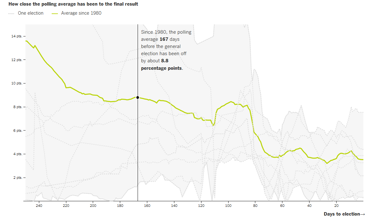
Here's a track record of polls in the US presidential elections between 1968 and 2012. FiveThirtyEight explains: "On average, the polls have been off by 2 percentage points, whether because the race moved in the final days or because the polls were simply wrong."

On average, you can expect 81% of all polls to pick the winner correctly.

The closer to the election day polls are conducted, the more accurate they are. 

"The chart shows how much the polling average at each point of the election cycle has differed from the final result. Each gray line represents a presidential election since 1980. The bright green line represents the average difference." (NYTimes, June 2016)

 
Source: The New York Times, June 2016

Source: The New York Times, June 2016


What about the 2016 polls?  The final national polls were not far from the actual vote shares. 

"Given the sample sizes and underlying margins of error in these polls, most of these polls were not that far from the actual result. In only two cases was any bias in the poll statistically significant. The Los Angeles Times/USC poll, which had Trump with a national lead throughout the campaign, and the NBC News/Survey Monkey poll, which overestimated Clinton’s share of the vote." (The Washington Post, December 2016)

 
Source: The Washington Post, December 2016

Source: The Washington Post, December 2016


So why then was Trump's win such a surprise for everyone?   

"There is a fast-building meme that Donald Trump’s surprising win on Tuesday reflected a failure of the polls. This is wrong. The story of 2016 is not one of poll failure.  It is a story of interpretive failure and a media environment that made it almost taboo to even suggest that Donald Trump had a real chance to win the election." (RealClearPolitics, November 2016)

In an experiment conducted by The Upshot, four teams of analysts looked at the same polling data from Florida. 

"The pollsters made different decisions in adjusting the sample and identifying likely voters. The result was four different electorates, and four different results."  In other words, a failure to interpret the data correctly."

Source: The Upshot

Source: The Upshot

(Here's a primer on how pollsters select likely voters.)

Nate Silver's list of what went wrong:
- a pervasive groupthink among media elites
- an unhealthy obsession with the insider’s view of politics
- a lack of analytical rigor
- a failure to appreciate uncertainty
- a sluggishness to self-correct when new evidence contradicts pre-existing beliefs
- a narrow viewpoint that lacks perspective from the longer arc of American history.

 In other words, when surveys don't work, “you must be holding it wrong”.


I Miss My Old Media

I miss all the news that fit to print -- not all the news, and pseudo-news, and churnalism, and press releases published verbatim, and gossip, and updates to gossip, and galleries, and listicles  that drive  just one more page view.

I miss editors who say no.

I miss reading Playboy -- or anything -- for the articles.

I miss cutting things out to save them for later.

I miss ads that sell hard from a full spread and feel good about it;  ads that don't stalk you, and nag you, and creep you out.

I miss hearing from my friends once a year and spending all night catching up and telling them how much their kids have grown since I'd last seen them because the last I'd seen them was a year ago.

I miss organically yellowed pictures.

I miss the way old film cameras used to smell.

I miss having just one TV remote on my couch.

I miss turning the dial on my radio, and hearing crackling, and static, and then catching a faint song that sounds like it's played thousands of miles away because it is.

I miss songs on the radio being selected by a human and not a playlist algorithm.

I miss knobs, and buttons, and dials, and switches.

I miss running to my mailbox and finding a handwritten letter.

Polling In The Dark

cinemascore2.jpg

How do you survey people in a dark movie theater?

CinemaScore conducts exit polls in theaters by asking movie goers to pull back tabs on the ballot, the design of which has remained mostly the same over the past 35 years.

CinemaScore tabulates the results and reports each movie's letter grade. Only 19 movies in the company's history got an F. The score is not a simple average:

CinemaScore has an algorithm,” [founder and president Ed] Mintz explains. “A long time ago, we tweaked and analyzed until we came up with what we thought to be the absolute right system. Obviously I can’t share that. That’s the McDonald’s secret sauce,” he laughs. “But if you have 100 ballots, even if you divided it evenly, and had 20 As, 20 Bs, 20 Cs, 20 Ds, 20 Fs — in school, that’s a C. In our curve, it’s a lot worse; a B in school is more equivalent to a C in our terms. When you start getting Bs with CinemaScore, it affects the algorithm and curve a lot harder than it does in school. If you have 20 percent Cs, 20 percent Ds, 20 percent Fs — imagine how bad that is.” (Vulture.com)

The results are used to estimate word of mouth and multiples— the overall gross in relation to the opening weekend.


The Effect of Incomplete Logos on Brand Perception

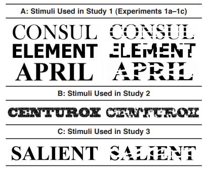
incomplete logos.png

A study has found that companies with typographic logos that are intentionally missing or blanked out parts of the characters (think IBM) are perceived as less trustworthy but more innovative.  "The former influence is tied to the logo's perceived clarity, while the latter influence is tied to its perceived interestingness."

Consumers with a prevention focus (?) have an overall unfavorable attitude towards the firms with incomplete logos.

What Does Your Typeface Taste Like?

In "The Taste of Typeface" paper: 

"Participants matched rounder typefaces with the word “sweet,” while matching more angular typefaces with the taste words “bitter,” “salty,” and “sour.”

Why would people match tastes and typefaces varying in their roundness and angularity? The more that an individual likes a taste, the more they will choose a round shape to match it to, and the less they like it, the more they will tend to associate the taste with an angular shape instead." 

Logos of Powerful Brands Should Be Placed Higher

Consumers prefer brands with a high standing and influence in the marketplace more when the logo is featured high on the packaging rather than low (source).

They prefer less powerful brands more when the brand logo is featured low rather than high.  "The underlying mechanism for this shift in preference is a fluency effect (?) derived from consumers intuitively linking the concept of power with height."

What about "fake it till you make it?"

"There is the possibility that managers may choose to place their logo high to signal power even when such a strategy does not match their brand’s true category standing. Although valid, the current research suggests that when category standing is known by the consumer, this strategy may not work."